
Order Status and Workflow
How an order moves through statuses, and the actions available at each step.
Each order progresses through a defined sequence of statuses from creation to completion. The In-Store App shows this progression visually as a status bar and provides an action card for moving the order — or an individual shipment — to its next state. When a transition triggers automated backend steps (sending notifications, reserving stock, updating fulfilment), those workflow steps are previewed in a confirmation dialog before any change is made.
Status progress bar
The progress bar appears near the top of the order detail view and shows where the order sits within its configured workflow.
Layout
The bar adapts to screen width:
| Screen width | Layout |
|---|---|
| Wide (≥ 600 px) | Horizontal row of circles connected by lines, with status labels below each circle |
| Narrow (< 600 px) | Pill-shaped badges arranged in a wrap layout |
Circle states
Each step in the progress bar is displayed as a coloured circle (on wide screens) or a pill badge (on narrow screens).
| State | Colour | Icon |
|---|---|---|
| Completed (visited) | Brand mid-tone | Checkmark |
| Current (active) | Brand primary | Filled dot |
| Upcoming (future) | Grey | Empty inner circle |
| Current — Cancelled | Red | Filled dot |
| Current — Returned / Refunded | Orange | Filled dot |
The active step label is shown in bold; completed and upcoming labels use regular weight.
The statuses shown in the bar are determined by the order type and tenant configuration. Different order types may have different sequences.
Status Update card
The Update Order Status card (or Update Shipment Status for orders with shipments) sits on the order detail page and is the primary control for advancing an order.
The card is hidden when:
- The order is read-only (for example, completed or fully cancelled with no further transitions available).
- No valid next status exists and the order has no shipments.
Card title
| Order type | Card title |
|---|---|
| Single-shipment or no shipments | Update Order Status |
| Multiple shipments | Update Shipment Status |
Shipment selector
When an order has two or more shipments, a Select Shipment dropdown appears at the top of the card. Each shipment in the list shows:
- Shipment ID (bold when a next step is available, with a green forward-arrow indicator)
- Current status → next status below the ID (green text when a next step is pending, grey otherwise)
Shipments that have a pending next step are sorted to the top of the list. Selecting a shipment updates the New Status dropdown below it.
New Status dropdown
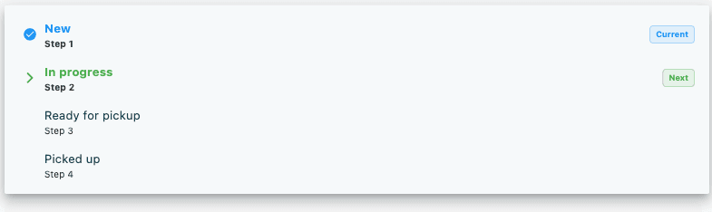
The New Status dropdown lists the statuses available for the currently selected shipment (or for the order, if there are no shipments). Each row shows:
- An indicator icon on the left:
- Blue checkmark — this is the current status
- Green forward arrow — this is the recommended next step
- Status name (bold for current and next; normal weight for others)
- A step number label below the name (for example, Step 3), or Other for statuses not in the primary sequence
- A badge on the right:
- Current badge (blue) — the current status
- Next badge (green) — the recommended next step
A Current: label below the dropdown always shows the status the order or shipment is in right now.
Filtering the status list
When shipments are present, a Filter button appears to the right of the Current: label. Tapping it opens a Show Statuses dialog with three options:
| Option | Description |
|---|---|
| Default | Shows primary workflow steps only — the shortest path through the order lifecycle |
| All Valid | Shows every status that is valid for the selected shipment |
| All | Shows every status configured for this order type |
The active filter is reflected in the button label (for example, Filter: Default).
Update button
The button below the dropdown changes appearance based on your selection:
| Selection | Button colour | Label |
|---|---|---|
| Default next step selected | Green | Set to [status name] (forward-arrow icon) |
| Any other status manually selected | Accent colour | Update Status (checkmark icon) |
| Update in progress | Disabled | Updating… (spinner) |
The button is disabled when no status is selected.
When no next step exists
If the order or the selected shipment has no recommended next step, the card shows only a Current: [status] line with a small edit icon. Tap it to expand the card and reveal the status dropdown and update button, allowing a manual transition.
Workflow preview dialog
Tapping the update button does not immediately change the status. A Update Order Status dialog opens first to show what will happen.
Preview phase
The dialog header shows:
- Order number
- Current status badge (blue) → new status badge (green) with a forward arrow between them
If the status transition triggers automated steps, the dialog lists them in numbered order under the heading The following workflow steps will be executed:. Examples of workflow steps include sending confirmation emails, triggering fulfilment actions, and updating stock.
If no steps are triggered, an information notice reads: Status will be updated without running workflow steps.
Two buttons appear at the bottom:
- Cancel — closes the dialog without making any change
- Update (green) — executes the status change and all listed workflow steps
Results phase
After the update completes, the dialog title changes to Workflow Results and the content switches to a results view:
| Outcome | Banner colour | Banner text |
|---|---|---|
| All steps succeeded | Green | Successfully updated |
| One or more steps failed | Orange | Completed with warnings |
A Workflow Actions section below the banner lists each step with its result:
| Icon | Meaning |
|---|---|
| Green checkmark | Step succeeded |
| Red error icon | Step failed |
| Orange info icon | Step completed with a warning |
Any failed step shows an error reason beneath its name.
A Close button at the bottom dismisses the dialog. The order detail reloads automatically to reflect the new status.