
Order Detail Overview
A tour of the panels available when you open an individual order.
Opening an order from the order list takes you to the order detail view. The view is divided into panels covering the order's status, line items, payments, totals, customer, store, and notes. This page describes each panel and how the layout adapts to different screen sizes.
Opening an order
Navigate to Orders in the main navigation and tap any row in the list to open it. The page title shows the order number once the order has loaded. If the order has not yet loaded, the title reads Order Details.
Page header
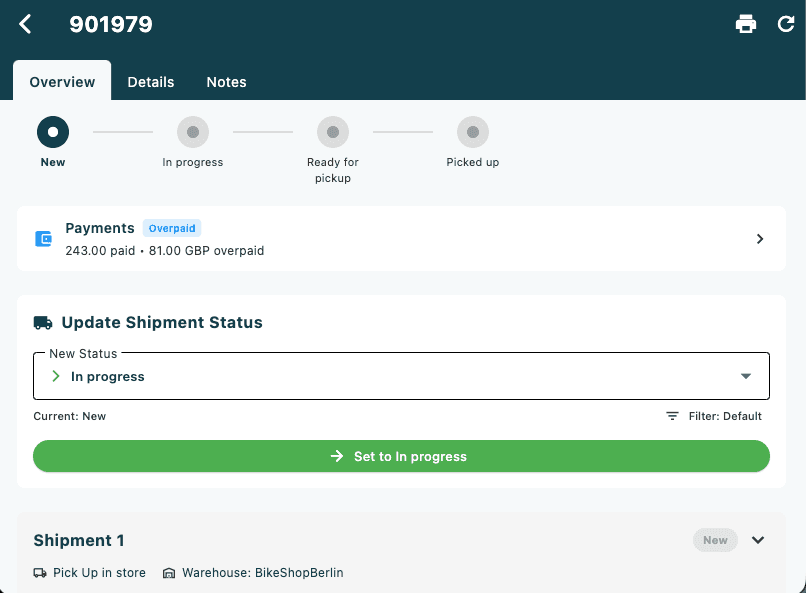
The AppBar contains:
| Element | Description |
|---|---|
| Order number | Shown as the page title (e.g. #10452) |
| Print icon | Opens print options — only shown when at least one print template is configured for the store (see Printing) |
| Refresh icon | Reloads the order from the server |
Layout
The detail view uses different layouts depending on screen width:
| Screen width | Layout |
|---|---|
| > 900 px (desktop / wide tablet) | Two-column scroll: order lines and totals on the left, all other panels on the right |
| ≤ 900 px (mobile / narrow tablet) | Three tabs: Overview, Details, Notes |
Desktop layout
The left column (wider) contains:
- Order lines grouped by shipment
- Order Totals summary
The right column contains (in order):
- Status Update Card
- Payments panel
- Order Information
- Customer
- Store
- Notes
Mobile tab layout
Overview tab — the main working view:
- Error banner (if the order has errors)
- Status progress bar
- Payments panel
- Status Update Card
- Order lines grouped by shipment
- Order Totals summary
Details tab — reference information:
- Order Information
- Customer
- Store
Notes tab — internal and public notes. The tab label shows the total note count when notes exist (e.g. Notes (3)).
Status progress bar
The status progress bar shows the order's position in the configured workflow. It appears at the top of the Overview tab (mobile) and above the two-column layout (desktop). If no progress bar statuses are configured for the tenant, this section is hidden.
| Screen width | Appearance |
|---|---|
| < 600 px | Coloured badge pills arranged in a row (wrapping if needed) |
| ≥ 600 px | Horizontal row of circles connected by lines |
Circle colours (desktop) / badge colours (mobile):
| State | Colour |
|---|---|
| Future step | Grey |
| Visited step | Lighter accent |
| Current step — normal | Accent |
| Current step — cancelled | Red |
| Current step — returned / refunded | Orange |
Visited steps show a check icon; the current step shows a filled dot.
Error banner
If the order has one or more errors recorded against it, a red bordered banner appears above the status progress bar. Each error message is listed in red text. When there are no errors, the banner is hidden.
For guidance on resolving order errors, see Handling Order Errors.
Payments panel
The Payments panel is a tappable card that summarises the payment position of the order.
| Element | Description |
|---|---|
| Wallet icon | Colour reflects payment status (see table below) |
| Title | Payments, or Payments ([count]) if there are multiple transaction groups |
| Status chip | Small coloured badge: Unpaid, Partially Paid, Paid, or Overpaid |
| Summary text | Compact payment summary, e.g. 100.00 paid • 399.00 NOK remaining |
| Chevron | Indicates the card is tappable |
Payment status colours:
| Status | Icon / chip colour | Meaning |
|---|---|---|
| Unpaid | Red | No payment has been registered |
| Partially Paid | Orange | Some payment registered, balance outstanding |
| Paid | Green | Full amount covered |
| Overpaid | Blue | Registered amount exceeds the order total |
Tap the card to open the Add Payment modal, where you can view existing payments and (if Experimental Mode is enabled) register a new payment. See Adding a Payment to an Order.
Order lines by shipment
Order lines are grouped by shipment. Each shipment section shows the shipment method name and the line items belonging to it. Tap a line item to select it; multiple lines can be selected at once.
For a full description of how order lines are displayed and how quantities (delivered, returned, cancelled) are shown, see Order Lines by Shipment.
Line selection and the action bar
When one or more order lines are selected, a floating action bar appears at the bottom of the screen:
- The bar shows the count of selected lines (e.g. 2 order line(s) selected).
- The edit (pencil) icon opens a menu with three actions:
- Cancel order lines — see Cancelling Order Lines
- Return order lines — see Creating a Return Order
- Create replacement order — see Creating a Replacement Order
- The × icon clears the selection.
Order Totals
The Order Totals card shows a breakdown of the order's financial summary:
| Row | Shown when |
|---|---|
| Subtotal | Always |
| Tax | Always |
| Shipping | Shipping cost is greater than zero |
| Discount (shown in green, prefixed with −) | A discount is applied |
| Total (bold, larger font) | Always, below a divider |
Status Update Card
The Status Update Card lets you advance the order through its workflow steps. It is described in detail on Updating Order Status.
Order Information
The Order Information card shows reference data about the order. Fields are shown only when they have a value.
| Field | Description |
|---|---|
| Order Number | The order reference number |
| Cart Name | Name given to the originating cart, if set |
| Tags | Accent-coloured chip badges for each tag on the order |
| Read Only badge | Lock icon + label shown when the order cannot be edited |
| Order Received | Date and time the order was created |
| Modified | Date and time of last modification (only shown if different from received) |
| Completed | Date and time the order was completed |
| Follow-up Date | Scheduled follow-up date, if set |
| Ready for Pickup | Date and time the order was marked ready for collection |
| Pick List Deadline | Deadline for the store to pick the order |
| Customer Pickup Deadline | Deadline for the customer to collect |
| Requested Delivery | Customer-requested delivery date |
| Order Type | The order type (e.g. Standard, Click & Collect) |
| Order Status | The current status name as text |
| Market | Market name or ID |
| Sales Channel | The channel the order originated from |
| Sales Person | Name of the staff member who created the order |
| Cart ID | ID of the originating cart |
| Customer Reference | Customer's own reference, if provided |
| Customer Requisition | Customer requisition number, if provided |
| Order Origin | Source system of the order |
| Priority Order badge | Orange star + label shown on priority orders |
| Related Orders | Blue chips linking to related order IDs |
| Replacement Orders | Green chips listing replacement order IDs |
| Projects | Purple chips listing associated project IDs |
| External IDs | Provider name + external ID pairs from integrated systems |
Customer
The Customer card shows the customer attached to the order. Fields are drawn from the billing address when available; otherwise from the order's customer fields directly.
| Field | Description |
|---|---|
| ID | Customer ID — tap to navigate to the customer detail page |
| Customer Number | Internal customer number |
| Type | Customer type (e.g. B2B) |
| Name | Customer full name |
| Customer email address | |
| Phone | Customer phone number |
| Address | Street address from the billing address |
| Location | Postal code and city |
If a Contact Person is recorded on the order, a divider and a sub-section appear below the main customer details showing the contact person's name, email, and phone.
Store
The Store card shows information about the store that owns the order. It is hidden when no store is associated.
| Field | Description |
|---|---|
| Store Name | Name of the store |
| Store ID | Internal store identifier |
| City | Store city |
| Address | Street name and number |
| Postal Code | Store postal code |
| Phone | Store phone number |
| Store email address |
Notes
The Notes panel lets you add internal and public notes to the order, and optionally send them by email or SMS. It is described in detail on Order Notes.
Printing
The print icon in the AppBar is shown only when at least one receipt template or PDF template is configured for the order's store and market.
| Scenario | What happens |
|---|---|
| Only one type of template (receipt or PDF) | Tapping the icon goes straight to that flow |
| Both receipt and PDF templates available | A popup menu appears with Print Receipt and Print PDF options |
| Multiple receipt templates | A Select Print Template dialog lists the templates; tap one to select, or tap the eye icon to preview |
| Multiple shipments | A Select Shipment to Print dialog lets you print a single shipment or All shipments at once |