
Searching Products
Find products in the catalogue by name, SKU, brand, or EAN, and add them directly to a cart.
The Products screen is the catalogue browser for store staff. Use it to look up a product during a customer interaction, check stock levels at this and other locations, and add items to a cart without going through the checkout flow.
The product list
The screen opens with the full catalogue loaded, sorted by most recently modified by default. Each product appears as a card showing:
| Element | Description |
|---|---|
| Product image | 60×60 thumbnail; placeholder icon if no image is available |
| Product name | Display name, up to two lines |
| Brand | Shown in accent colour below the name, if set |
| SKU | Shown below the brand for SKU-level products |
| Colour / Size chips | Small chips with an icon, shown when values are present |
| Price | Unit price and currency code |
| Inventory badge | Tap the badge to see a per-warehouse breakdown. Green when stock is above 10, orange for 1–10, red for 0. |
| Variants chip | For parent products, a chip shows how many variants the product has (e.g. 3 variants). Individual variant SKUs are not shown at list level. |
Inactive products are shown with a faded image, an orange dot next to the name, and a small orange visibility-off icon in the bottom-right corner of the thumbnail.
Cart quantity badge: if the product (or any of its variants) is already in the active cart, a quantity badge appears in the top-left corner of the card showing xN.
Searching
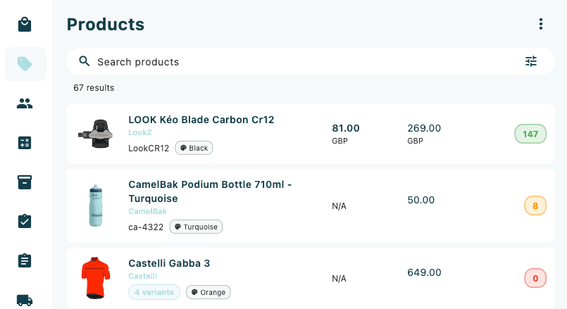
The search bar at the top of the screen accepts free-text search across product names, SKU codes, brands, and EANs.
- Tap the Search products field.
- Type any part of the product name, SKU, brand, or EAN. Results update automatically as you type (with a short delay).
- The result count below the search bar updates to show the number of matching products, for example 42 results.
- Clear the field to return to the full catalogue.
Filtering
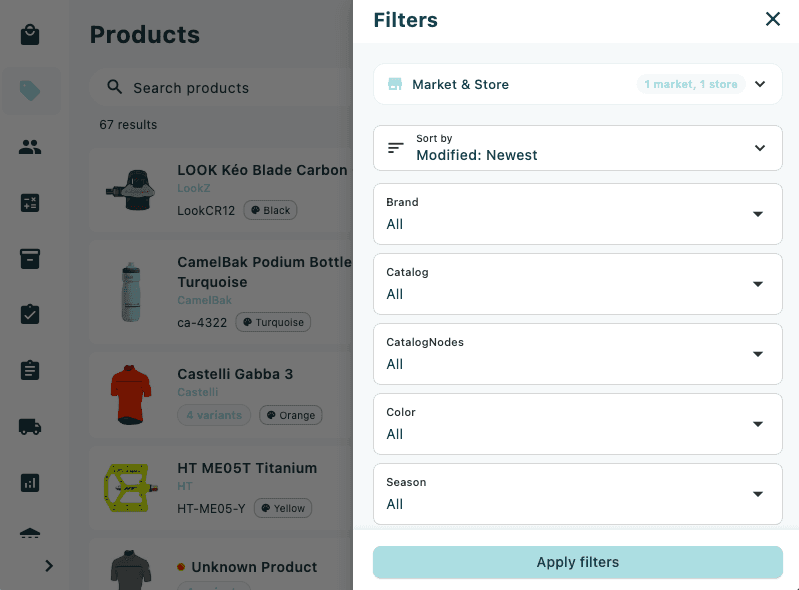
Tap the filter icon (tune icon) on the right side of the search bar to open the Filters panel. A numbered badge on the icon shows how many filters are currently active.
Available filters
| Filter | Description |
|---|---|
| Market / Store | Limit results to specific markets or stores |
| Sort Order | Choose how results are ordered (see Sort options below) |
| Facets | Attribute facets populated from your search results (e.g. Brand, Colour) — each shown as a multi-select dropdown |
| Categories | One or more product categories |
| Published Date | Date range for when the product was published |
| Price | Minimum and maximum unit price |
| On Sale | Yes / No / Either (tri-state toggle) |
| In Stock | Yes / No / Either |
| Active | Yes / No / Either |
| Published | Yes / No / Either |
| Deleted | Yes / No / Either |
Tap Apply filters at the bottom of the panel to close it and refresh the results. To remove all filters at once, tap Clear All in the panel header.
Active filters appear as chips below the search bar. Tap the × on any chip to remove that individual filter without reopening the panel.
Sort options
The sort order selector groups options by type:
| Group | Options |
|---|---|
| Relevance | Best Match, Most Popular |
| Created Date | Newest, Oldest |
| Modified Date | Newest, Oldest |
| Published Date | Newest, Oldest |
| Price | Low → High, High → Low |
| Cost Price | Low → High, High → Low |
| Discount | High → Low, Low → High |
| Inventory | High → Low, Low → High |
| Ratings | High → Low, Low → High |
| Brand | A → Z, Z → A |
| Supplier | A → Z, Z → A |
| Catalog | A → Z, Z → A |
| Location | A → Z, Z → A |
| Product Name | A → Z, Z → A |
| SKU ID | A → Z, Z → A |
| Sort Index | Low → High, High → Low |
Selecting a product
Tap any product card to select it. A coloured border appears around the card and two action buttons appear below the product details:
- Add to cart — adds the item to the active cart.
- If the product is a single SKU, it is added directly. A brief confirmation snack bar confirms the action.
- If the product has variants, a variant selection sheet opens. Choose a variant from the list to add it.
- Go to product — opens the Product Detail view.
Tap the same card again to deselect it and hide the action buttons.
Add to cart adds one unit at a time. If no cart is open, a new cart is created automatically using your device's default store and order type.
Scanning a barcode
On Android and iOS devices, a Scan option is available in the overflow menu.
- Tap the ⋮ (more options) button in the top-right corner.
- Tap Scan.
- Point the camera at a product barcode or EAN label.
- If a matching product is found, a dialog appears showing the product name, brand, SKU, EAN, colour, size, and price, with two buttons:
- Add to cart — adds the scanned item to the active cart.
- Go to product — opens the Product Detail view.
- If no product matches the scanned code, a snack bar informs you.
Barcode scanning is only available on Android and iOS. It is not shown on the web version of the app.
Pagination
When the catalogue contains more than 20 products, pagination controls appear at the bottom of the list showing the current page number and total pages. Tap the left or right arrow to move between pages.
Offline mode
If the device loses connectivity and products have been synced previously, the list falls back to the local cache. An offline indicator banner appears at the top of the list showing when the cache was last synced. Inventory data is not shown in offline mode.
Sync products while the device is online to ensure the offline cache is up to date. If the cache is empty, no products will be shown when offline.
Menu actions
Tap the ⋮ (more options) button in the top-right corner for additional actions:
| Action | Description |
|---|---|
| Refresh | Reload the product list from the server |
| Scan | Open the camera barcode scanner (Android and iOS only) |