
Product Detail
View the full details of a product, including images, pricing, stock levels, variants, and properties.
The Product Detail view shows everything stored for one product: images, pricing, per-warehouse inventory, variants, categories, custom properties, and more. Open it by tapping Go to product on any product card in the Products list, or via the barcode scanner dialog.
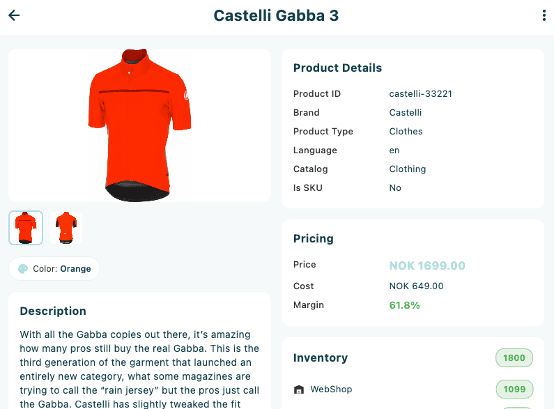
Layout
The layout adapts to the available screen width:
| Width | Layout |
|---|---|
| Wide (>1000 px, with enough space for variants) | Two-column — product information on the left (2/3), variants list on the right (1/3) |
| Narrow | Single-column — product information stacked above the variants list |
Within the product information area, sections are further arranged into one, two, or three columns depending on available width.
Status indicator
If the product is not in an active, published state, a coloured banner appears at the top of the information area:
| Colour | Meaning |
|---|---|
| Red | The product has been deleted |
| Orange | The product is inactive |
| Grey | The product has a non-standard status (the status name is shown) |
Images
The image gallery shows the product's main image and any additional assets in a 220 px high display area. If multiple images are available, a thumbnail strip appears below the main image.
- Tap a thumbnail to switch the main image.
- Tap the main image to open a full-screen gallery. In the gallery, swipe left and right to move between images, pinch to zoom, and tap outside the image or use the × close button to exit.
Quick info chips
Directly below the images, chips summarise the most commonly referenced attributes. Chips only appear when the field has a value.
| Chip | Field |
|---|---|
| Colour | Product colour |
| Size | Product size |
| Season | Season |
| Gender | Gender |
Product Details
The Product Details card lists identifying and classification fields. Fields only appear when they have a value.
| Field | Description |
|---|---|
| SKU | Stock keeping unit code |
| Product ID | Internal product identifier |
| Brand | Brand name |
| Product Type | Classification type |
| Language | Content language |
| Unit | Unit of measure |
| Location | Physical location in the store or warehouse |
| Catalog | Catalogue assignment |
| Is SKU | Whether this record is a specific variant (Yes / No) |
| Type | Package, Bundle, or Kit — shown with an icon when applicable |
| Country of Origin | Country where the product was manufactured |
| Customs Code | Tariff or HS code |
| Weight | Weight in kg |
| Supplier SKU | Supplier's own reference for this SKU |
| Alt. Name | Alternative product name |
Pricing
The Pricing card shows the selling price, cost, and calculated margin.
| Field | Description |
|---|---|
| Price | Unit selling price with currency code, shown in accent colour |
| Cost | Cost price with currency code |
| Margin | Percentage margin calculated from price and cost. Green when 30% or above, orange between 10–30%, red below 10%. |
Inventory
The Inventory card lists stock levels per warehouse, sorted from highest to lowest. The card header shows a total inventory badge.
Each warehouse row shows:
- Warehouse code
- Quantity badge — green when above 10, orange for 1–10, red for 0
The list is scrollable when it exceeds the available height. Gradient overlays at the top and bottom indicate that more rows can be scrolled to.
Description
The Description card shows the product's long description, stripped of any HTML markup.
Tags
The Tags card displays any tags assigned to the product as accent-coloured chips.
Categories
The Categories card lists all categories the product belongs to. The main category is shown first with a star icon and a Main label. Other categories have a folder icon.
Properties
The Properties card shows custom attribute key–value pairs. Properties are grouped by group name, and each group is collapsible.
- Groups are expanded by default.
- Tap a group header to collapse or expand it.
- If the product has five or more groups, a collapse/expand all button appears in the card header.
When the card is collapsed (via the header button), it shows a summary such as 12 properties — tap to expand.
Timeline
The Timeline card shows dates relating to the product's lifecycle. Fields only appear when set.
| Field | Description |
|---|---|
| Created | Date the product record was created |
| Modified | Date it was last modified |
| Published | Date the product was published |
| Stop Published | Date publishing ends — shown with a warning icon if the date has already passed |
| Discontinued | Date the product was discontinued — shown with a warning icon if already past |
| Expected Delivery | Expected date for next stock delivery |
Supplier
The Supplier card is shown only when supplier information is available.
| Field | Description |
|---|---|
| Name | Supplier name |
| Supplier ID | Supplier identifier |
| Supplier SKU | Supplier's own reference |
| Lead Time | Supplier lead time in days |
Ratings
The Ratings card is shown when rating data is available. It displays a five-star visual with the numeric average and the total review count in brackets.
Variants
The Variants section (shown to the right on wide screens, or stacked below the information area on narrow screens) lists all variants of the product with their count shown in a badge next to the Variants heading.
Each variant row shows:
| Element | Description |
|---|---|
| Image | 60×60 thumbnail (falls back to the parent product's image) |
| Name | Variant display name |
| SKU | Variant SKU code |
| Colour / Size chips | Small chips, shown when values are present |
| Price | Unit price and currency code |
| Inventory badge | Total stock across all warehouses — green >10, orange 1–10, red 0 |
Tap any variant row to open a bottom sheet with full variant details.
Variant detail sheet
The bottom sheet can be dragged to expand or collapse. It contains:
Header: variant image (100×100), name, SKU, and price.
Details section:
| Field | Description |
|---|---|
| Colour | Variant colour |
| Size | Variant size |
| GTIN | Global trade item number |
| Weight | Weight in kg |
| Cost | Cost price with currency code |
Inventory section: per-warehouse stock levels, one row per warehouse.
Price List section: price per price list, showing the price list ID and unit price.
If an RFID printer is paired and label templates are configured, a ⋮ (more options) button appears in the variant detail sheet header. Tap it and select Print RFID Label to send an RFID label for that variant to the connected printer.
Menu actions
Tap the ⋮ (more options) button in the top-right corner of the screen:
| Action | Description |
|---|---|
| Print PDF | Generate and print a product PDF. If multiple PDF templates are configured, a template selector dialog opens first. Only visible when PDF templates are configured for the product area. |
| Print RFID Label | Send an RFID label to the connected RFID printer. Only visible when an RFID printer is paired and label templates are configured. |
| Refresh | Reload the product from the server. |
Print PDF and Print RFID Label are only available when the relevant templates and hardware are configured in your tenant settings. If you do not see these options, contact your store manager.